WA and IRO — reviewed by Stella
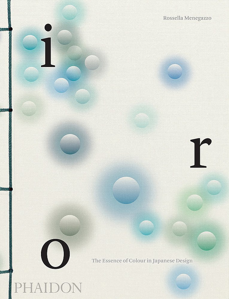
Some books are a pleasure to look at, to handle, and to have close at hand for inspiration. The way a book is designed can alter your interaction with it. The choice of font, layout, paper stock, binding, and the content/space (the white of the page) ratio all affect your reading experience. Whether this is a novel or an art book, the design of a book should be pleasing, and yet unnoticeable. It should feel right. If you are interested in design, like Japanese aesthetics, and like a set, then these two books are awaiting your pleasure. I’ve owned a copy of Wa: The Essence of Japanese Design for a few years and I never tire of it. Wa is not only filled with gorgeous examples of wood, metal, and textile objects, it's a design object in itself. Beautifully bound with striking stitching, the pages are made from folded fine paper so from the moment you pick it up it feels special. Within the covers of the book, the pages carry the essence of Japanese aesthetic with typographic design and placement of images on the page which are pleasing and thoughtfully arranged. Split into different media (textile, wood, metal, etc), each chapter has an essay discussing the area and the contemporary approach to each. It’s altogether a stunning book. And its partner, Iro: the Essence of Colour in Japanese Design, is just as compelling.


